Update: February 7, 2020
This is an update to a post The Ever Changing Climate with a new slide showing fluctuating Alpine glaciers over several thousand years. Context below is from the previous post along with the new content.
Raymond of RiC-Communications studio commented on a recent post and made an offer to share here some graphics on CO2 for improving public awareness. He produced 12 interesting slides which are presented in the post Here’s Looking at You, CO2. I find them straightforward and useful, and appreciate his excellent work on this. Project title is link to RiC-Communications. This post presents the five initial charts he has so far created on a second theme The World of Climate Change and adds another regarding Alpine glacier studies by two prominent geologists. In addition, Raymond was able to consult the work of these two experts in their native German language.
This project is The World of Climate Change
Infographics can be helpful, in making things simple to understand. Climate change is a complex topic with a lot of information and statistics. These simple step by step charts are to better understand what is occurring naturally and what could be caused by humans. What is cause for alarm and what isn’t cause for alarmism if at all. Only through learning is it possible to get the big picture so as to make the right decisions for the future.
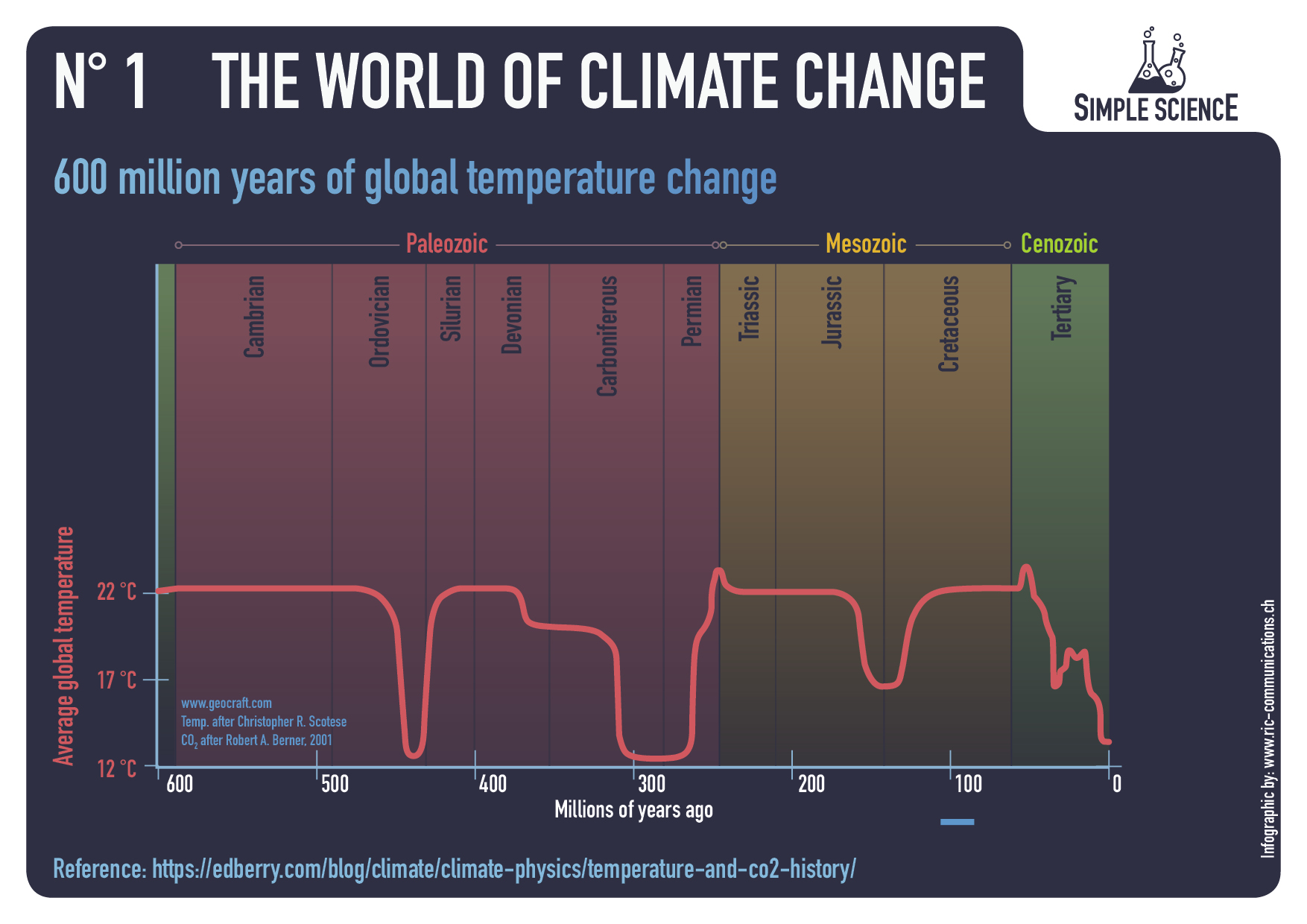
– N° 1 600 million years of global temperature change
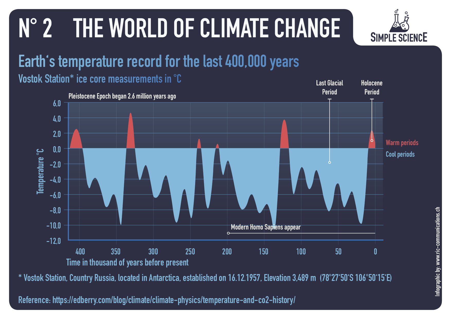
– N° 2 Earth‘s temperature record for the last 400,000 years
– N° 3 Holocene period and average northern hemispheric temperatures
– N° 4 140 years of global mean temperature
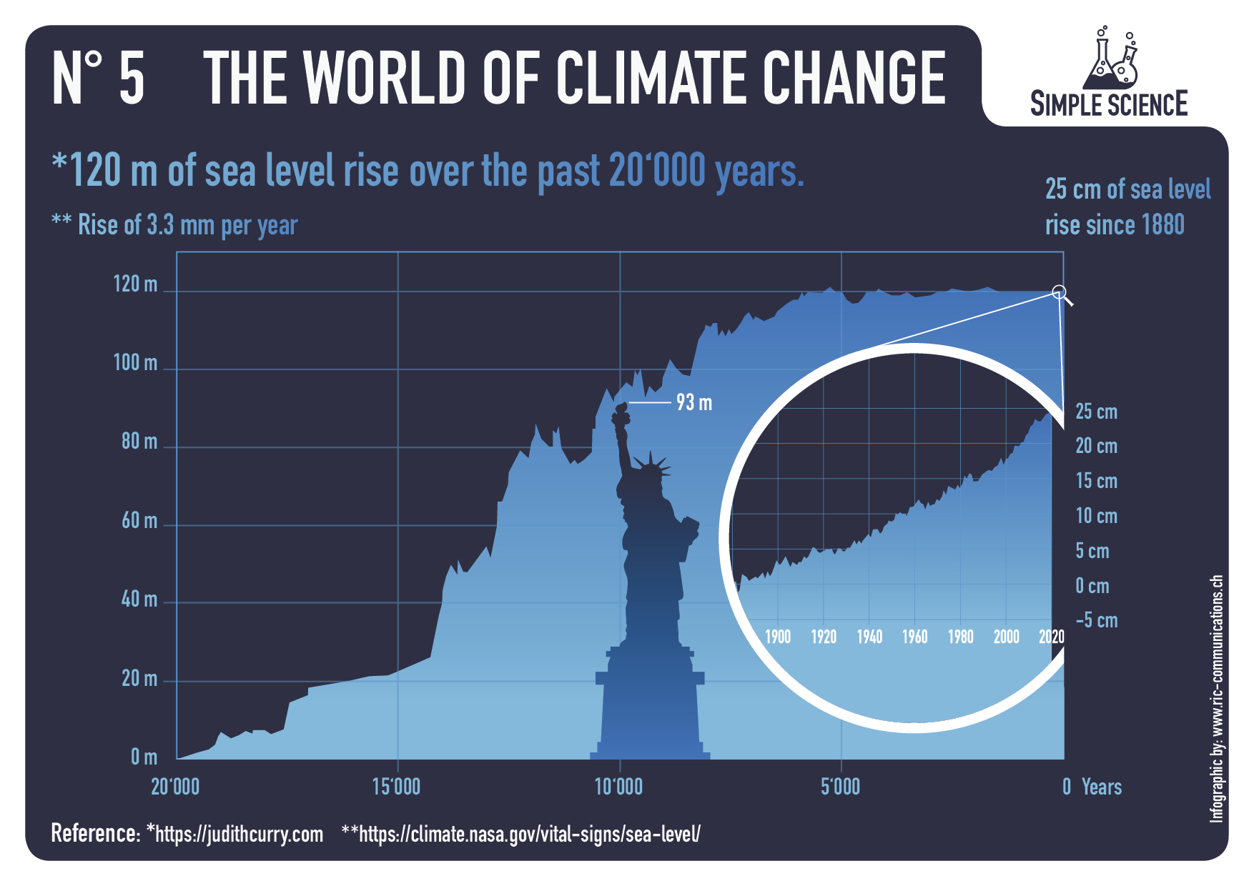
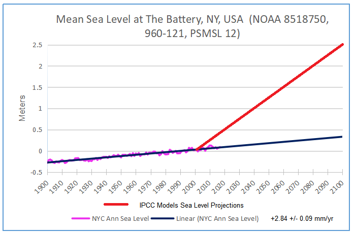
– N° 5 120 m of sea level rise over the past 20‘000 years
– N° 6 Eastern European alpine glacier history during the Holocene period.


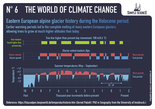
Summer Temperatures (May – September) A rise in temperature during a warming period will result in a glacier losing more surface area or completely vanishing. This can happen very rapidly in only a few years or over a longer period of time. If temperatures drop during a cooling period and summer temperatures are too low, glaciers will begin to grow and advance with each season. This can happen very rapidly or over a longer period in time. Special thanks to Prof. em. Christian Schlüchter / (Quartärgeologie, Umweltgeologie) Universität Bern Institut für Geologie His work is on the Western Alps and was so kind to help Raymond make this graphic as correct as possible.
Comment:
This project will explore information concerning how aspects of the world climate system have changed in the past up to the present time. Understanding the range of historical variation and the factors involved is essential for anticipating how future climate parameters might fluctuate.
For example:
The Climate Story (Illustrated) looks at the temperature record.
H20 the Gorilla Climate Molecule looks at precipitation patterns.
Data vs. Models #2: Droughts and Floods looks at precipitation extremes.
Data vs. Models #3: Disasters looks at extreme weather events.
Data vs. Models #4: Climates Changing looks at boundaries of defined climate zones.
And in addition, since Chart #5 features the Statue of Liberty, here are the tidal guage observations there compared to climate model projections:

Reblogged this on Climate Collections.
LikeLike
Morning Ron
Thanks for the reposting. I wonder if Christian Schlüchter can get me the data for the western alps. I’m not sure how he’s done his own charts. The chart I used is from Gernot Patzelt and he added his data sets over that chart. I’m waiting for his feedback, he’s a really nice guy. He’s very concerned that this whole hysteria is hurting the scientific community, especially when the backlash comes, if ever.
You have a nice weekend… Cheers Ray
LikeLike
Hi Ron
There’s a discussion about the 15 °C baseline for chart Number 3. The average global mean temperatures is supposed to be at the magic 15 °C. However chart 3 shows the average global temperature from the Norther Hemisphere with temperatures above 15 °C. This poses some confusion since in chart 4 the temperatures is below 15 °C.
Since there is no chart that I can show for the global Holocene period, some people could get confused. I know the difference, but often people can’t imagine that the planet is divided in a different zones.
Cheers R
LikeLike
Raymond, Both GISS LOTI (land and ocean) and HADCRUT4 (land and ocean) use 14.0 Celsius as the climate normal in the modern era.
LikeLike
Hi Ron, thanks, got it.
I’ve got a new chart that I’d like to do in the very near future.
Titel:
The costs in materials to reduce CO2 emissions
Mass of Materials (tonnes/TWh)
– Cement
– Concrete
– Glass
– Fuel
– Steel
– Other
Energy Source
– Solar PF
– Hydro
– Wind
– Geothermal
– Nuclear.
I put the graph at the bottom of the CO2 list.
The chart will be based off of
https://www.energy.gov/quadrennial-technology-review-2015
https://www.forbes.com/sites/michaelshellenberger/2018/04/25/yes-solar-and-wind-really-do-increase-electricity-prices-and-for-inherently-physical-reasons/#488d2b2617e8
https://www.fennonen.fi/en/article-page/renewable-energy-problematic-buzzword
I was really surprised at how much energy is involved to produce energy.
LikeLike
Raymond, sounds interesting. With that one you are moving into a third theme, The World of Climate Policy, (or a more restricted one World of Renewables)
LikeLike