
People are duped by false alarms about Arctic sea ice because they have (subliminally) bought into the notion likening the Arctic to their home refrigerator. This post is to dissuade you from taking on board that false analogy.
Inside Your Fridge
When you put liquid water into your fridge, it releases heat, both sensible and latent, the air in the compartment warms and the heat engine extracts the warming to maintain a constant temperature.

The energy is substantial: it takes 417 kj per kilogram of water to go from room temperature (20C) to ice or vice-versa. The math from Wikipedia is:
To heat ice from 273.15 K to water at 293.15 K (0 °C to 20 °C) requires:
(1) 333.55 J/g (heat of fusion of ice) = 333.55 kJ/kg = 333.55 kJ for 1 kg of ice to melt
PLUS
(2) 4.18 J/(g·K) × 20K = 4.18 kJ/(kg·K) × 20K = 83.6 kJ for 1 kg of water to increase in temperature by 20 K
= 417.15 kJ
And of course if you leave the door open, the refrigeration unit is unable to remove the heat efficiently, the freezing process slows and less ice is produced. Also when electric power is lost, everything frozen starts melting and perishable food spoils.
Alarmists sometimes say that when the jet stream wanders south from the Arctic (“the polar vortex”), it is like leaving the fridge door open and sea ice will be lost as a result. This is upside down and backwards, since the Arctic does not at all resemble a refrigerator.
Inside the Arctic
In the Arctic (and also at the South Pole), the air is in direct contact with an infinite heat sink: outer space. The tropopause (where radiative loss upward is optimized) is only 7 km above the surface at the poles in winter, compared to 20 km at the equator. There is no door to open or close; the air is constantly convecting any and all energy away from the surface for radiation into space.
Instead of an open door, Arctic ice melts when the sun climbs over the horizon. Both the water and air are warmed, and the ice cover retreats until sundown in Autumn.
Most people fail to appreciate the huge heat losses at the Arctic pole. Mark Brandon has an excellent post on this at his wonderful blog, Mallemaroking.
By his calculations the sensible heat loss in Arctic winter ranges 200-400 Wm2.
The annual cycle of sensible heat flux from the ocean to the atmosphere for 4 different wind speeds.
As the diagram clearly shows, except for a short time in high summer, the energy flow is from the water heating the air.
“Then the heat loss over the 2×10⁹ m2 of open water in that image is a massive 600 GW – yes that is Giga Watts – 600 x 109 Watts.
If you want to be really inappropriate then in 2 hours, that part of the ocean lost more energy than it takes to run the London Underground for one year.
Remember that is just one component and not the full heat budget – which is partially why it is inappropriate. For the full budget we have to include latent heat flux, long wave radiation, short wave radiation, energy changes through state changes when ice grows and decays, and so on. Also large heat fluxes lead to rapid sea ice growth which then insulates the ocean from further heat loss.”
The Key Difference
The really big paradigm shift is to understand that the sea ice extent itself regulates the periods of warming and cooling air temperatures, and not the other way around. Of course, there is a considerable lag, on the order of several decades, as you would expect in any system with massive capacity and momentum. Zakharov (here) shows how Arctic ice functions as a self-oscillating system:
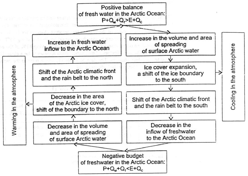
Zacharov fig.24
Summary: Why the Arctic is not a Refrigerator
1. A fridge makes ice by keeping the air below freezing.
The Arctic makes ice by keeping warmer water away.
2. Ice melts in a fridge when warmer air is allowed in.
Ice melts in the Arctic when the sun shines.
3. The fridge is regulated by an air temperature sensor.
The Arctic is regulated by the ice extent itself.

This graph of the sea ice extent (30 % coverage) by DMI seems to confirm this oscillation:

the almost record low sea-ice extent maximum last year has been followed by almost record level maximum this year.
LikeLike
Thanks for that Pethefin; I had not looked at DMI lately and am surprised to see how strongly that index is rebuilding. MASIE is only slightly above the ten-year average.
LikeLike
The DMI is the only institution – as far as I know – to follow the 30 % coverage, which is less prone to fluctuations in wind and sea current conditions.
There are of course long period records collected by Norwegian Polar Institute, discussed in this excellent blog post:
http://blog.heartland.org/2016/02/misleading-claims-about-a-climate-crisis-in-the-arctic-must-be-corrected/
and found in here (together with other equally important analysis):
http://www.climate4you.com/SeaIce.htm#Sea ice extension in a longer time perspective
all these put the current Arctic sea-ice scare into proper perspective.
LikeLike
Ron, since I have not used MASIE, I have problems figuring out what kind of ice coverage they are using. Do you have an idea what percentage of ice coverage they are using, I had difficulty finding clear information on this matter.
LikeLike
The DMI product above uses 30 % coverage which is less prone to wind and sea current conditions. The data seems to have become so inconvenient for the CAGW-movement that the DMI has removed all links to it from their website, although they keep updating it.
LikeLike
Heck the DMI finally did it. They have now finally discontinued the inconvenient 30 % ice coverage index and replaced it with a picture where the recent rise of the sea ice after October 2015 has been “reinterpreted”:

Luckily I had been archiving their website with help of WayBackMachine: http://web.archive.org/web/*/http://ocean.dmi.dk/arctic/plots/icecover/icecover_current.png
and
http://web.archive.org/web/20160214084633/http://ocean.dmi.dk/arctic/old_icecover.uk.php
So there were no true scientists left at the DMI after all.
LikeLike
For some reason the graph above is not the updated version, you need to click on it in order to see what the DMI has done with it.
LikeLike
As you can see in the updated version of the graph, the DMI not only “reinterpreted” the 2015 data, the removed it entirely for 2016, just when the index had tied the 10 year high of 2010 (as you can see in the archived versions of the graph).
LikeLike
By the way, here’s an excellent blog post on the sea ice scare that discusses the long period records of the Norwegian Polar Institute that really put the current sea ice scare into proper perspective:
http://blog.heartland.org/2016/02/misleading-claims-about-a-climate-crisis-in-the-arctic-must-be-corrected/
LikeLike
Pethefin, the MASIE product is based on ice charts developed for navigational purposes, using multiple sources of info including the passive microwave readings from satellites. The ice edges are determined at 15% concentrations at a resolution of 4 km, compared to 24 km for NSIDC. Thus MASIE results are more precise, but as you note will include more marginal ice than DMI with 30% standard.
In fact the Arctic ice cover is composed of two sorts of ice: Drift ice, which lasts all year long; and fast ice, which is connected to the shore and mostly melts out every summer. So DMI is a better measure of the perennial drift ice cover in the Arctic.
More on satellite vs navigational ice observations:
https://rclutz.wordpress.com/2015/03/30/everything-you-wanted-to-know-about-measuring-arctic-ice-but-were-afraid-to-ask/
https://rclutz.wordpress.com/2015/03/31/comparing-noaa-and-masie-arctic-ice-extent/
LikeLike
Thanks Ron, based on the data I suspected that they were using coverage criteria round 10-15 %, nice to have it confirmed.
Are you BTW aware of the curious story of the data from the early years of satellite observations (1973-1978) of sea-ice? The IPCC included those in their reports from 1990, as shown by Tony Heller with his highlighting of the “problem” here:

The 1990 IPCC WG1 Report page 224, introduced the figure 7.20 (above) in the following manner:
“Sea-ice conditions are now reported regularly in marine synoptic observations, as well as by special reconnaissance flights, and coastal radar. Especially importantly, satellite observations have been used to map sea-ice extent routinely since the early 1970s. The American Navy Joint Ice Center has produced weekly charts which have been digitised by NOAA. These data are summarized in Figure 7.20 which is based on analyses carried out on a 1° latitude x 2.5° longitude grid. Sea-ice is defined to be present when its concentration exceeds 10% (Ropelewski, 1983). Since about 1976 the areal extent of sea-ice in the Northern Hemisphere has varied about a constant climatological level but in 1972-1975 sea-ice extent was significantly less.”
In the 1996 IPCC SAR WG1 Report, a similar but updated figure was presented on page 150, with the following introduction:
“3.2.5.3 Sea ice extent and mass
Neither hemisphere has exhibited significant trends in sea ice extent since 1973 when satellite measurements began (Figure 3.8).”
By 2001, the data had been “reinterpreted” and the corresponding figure found here:
http://ipcc.ch/ipccreports/tar/wg1/062.htm
looks dramatically different compared with the two previous figures (7.20 from 1990 and 3,8 from 1996). The “reinterpretation” was rather embarrassing since they used sea ice data from the Great Lakes. When one looks at the three graphs (1990, 1996 and 2001) side by side, one can not but wonder what were they thinking.
By 2007 the IPCC abandoned both the early data and its 2001 reinterpretation altogether and pretended that the early data did not exist. Thereafter, the data from the early years seems to have been conveniently forgotten and we are usually told that the satellite observations began in 1979.
I hope this comes through, my previous post with several links was stuck for a long time.
LikeLike
Yes, the Norwegian and Russian ice charts clearly show in the 1930s-40s less ice than today, and a recovery prior to 1980 producing larger extents than today
LikeLike
For a long time I misinterpreted the meaning of charts like the recent one below from DMI
Those are air temperatures, and if they are above average, it means that the water is losing more heat than past normals. It’s not that warmer air causes ice melt, but the other way around: Oceans are always moving heat, and more open water means more heat loss into the air, resulting higher air temperatures, though still way below freezing.
For comparison, look at the same chart from 1977 when ice extent was much higher the entire year:
LikeLiked by 1 person