
Update January 3, below.
This year end report shows there is no reason to worry about Arctic ice melting. Against the odds, 2015 recovered from:
The blob melted Bering Sea a month early; it’s now well ahead of 2014.
An August storm pushed extent down for 28 days; it now nearly matches 2014.
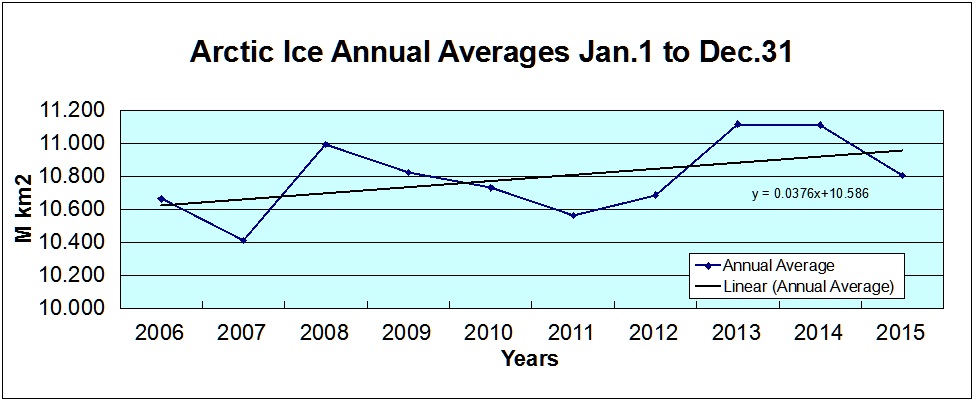
MASIE measurements show that 2007 ice extent was lower than any year since. It is now confirmed that 2015 average annual extent exceeds 2007 by about 400,000 km2. That difference arises from comparing 2007 annual average of 10.414 M km2 with 2015 average through day 365 of 10.808. That makes 2015 virtually tied with 2009 for fourth place in the last ten years.
Summary:
Arctic ice declined in the decade prior to 2007, but has not declined since.
Alarmists chafe at the words “growing” and “recovery”, and I use them poetically to counter “death spiral” terminology. What we have seen in the last decade is a plateau in Arctic ice extent, analogous to the plateau in surface temperatures. The rise since 2007 is slight and not statistically important, just as the loss of ice from 1979 to 1994 in the NOAA dataset was too slight to count as a decline.
Note: Something unusual happened in the MASIE record. After increasing ice extent steadily at a rate of 87k km2 per day after Dec. 10, MASIE stopped showing growth and declined a bit after Dec. 23. Ice extent was lost in Kara, Barents and Greenland Seas. That allowed NOAA extent to catch up and reduce its deficit. Previously, NOAA showed ~400k km2 less than MASIE, that difference being typical historically. For the year NOAA shows about 200k km2 less than MASIE, both at year end and for the annual average.
MASIE Comparison 2014 and 2015 Day 365
| Ice Extents | Ice Extent | ||
| Region | 2014365 | 2015365 | km2 Diff. |
| (0) Northern_Hemisphere | 13330376 | 13027597 | -302778 |
| (1) Beaufort_Sea | 1070445 | 1070445 | 0 |
| (2) Chukchi_Sea | 966006 | 965989 | -17 |
| (3) East_Siberian_Sea | 1087137 | 1087120 | -17 |
| (4) Laptev_Sea | 897845 | 897809 | -36 |
| (5) Kara_Sea | 935023 | 876266 | -58757 |
| (6) Barents_Sea | 641686 | 342398 | -299288 |
| (7) Greenland_Sea | 619029 | 557954 | -61075 |
| (8) Baffin_Bay_Gulf_of_St._Lawrence | 1023477 | 1181297 | 157820 |
| (9) Canadian_Archipelago | 853214 | 853178 | -36 |
| (10) Hudson_Bay | 1260903 | 1260723 | -181 |
| (11) Central_Arctic | 3245389 | 3202967 | -42422 |
| (12) Bering_Sea | 255711 | 373594 | 117883 |
| (13) Baltic_Sea | 7527 | 2850 | -4677 |
| (14) Sea_of_Okhotsk | 454321 | 345063 | -109258 |
| (15) Yellow_Sea | 4475 | 4312 | -163 |
| (16) Cook_Inlet | 130 | 4490 | 4360 |
The small overall difference between 2014 and 2015 at this point matches the deficit in Barents Sea. The major basins have recovered: Central Arctic, BCE (Beaufort, Chukchi, East Siberian), Canadian Archipelago. Bering Sea is freezing well ahead of last year, as is Baffin Bay, offsetting deficits elsewhere except for Barents.
Technical Note: Changes in Ocean Water Structure drive changes in Arctic Ice Extent, and air temperature varies as a result, not the cause.
https://rclutz.wordpress.com/2015/12/23/arctic-sea-ice-self-oscillating-system/

Melt ponds refreezing in the Arctic.
Update January 3, 2015
Neven is the first to attack this post in comments below, followed by a post at his own blog in which he says:
“misleading and embarrassing statements”
“older gentleman”
“mind set in concrete”
“taken apart by Tamino”
“data misrepresentation”
And on cue Tamino’s (Foster’s) attack dogs are coming here. Now I responded to all of Neven’s and Foster’s bogus objections in Sept. (here). Since they either did not read or did not understand, I will repeat the salient points again.
Warmists fail to see that having two different tracking methods for a climate phenomenon is a good thing. With temperatures they favor the land surface record and abhor the satellite temps. With Sea Ice they like the satellite reports and abhor the navigational observations. JAXA, DMI, NORSEX and NOAA (or NSIDC) are all using data from passive microwave sensors on satellites to estimate ice extents. Some differences arise from differing algorithms at each center.
Naval authorities have for centuries prepared ice charts for the safety of ships operating in the Arctic. There are Russian, Danish, Norwegian, and Canadian charts, in addition to MASIE, the US version. These estimates rely on multiple sources of data, including the NASA reports. Charts are made with no climate ax to grind, only to get accurate locations and extents of Arctic ice each day.
MASIE is not the only dataset to show this lull in Arctic ice decline. It is also obvious in Foster’s final graph. I showed how the same pattern appears in the NOAA (technically NOAA@NSIDC) dataset (here). Those who object that a decade is too short to claim a recovery were quick to claim a decline (even a “death spiral”) based on a decade-long loss of ice ending in 2007.
Some were upset that I used the MASIE data, despite NSIDC cautions against it. For the record, the NSIDC Background cites as support a study by Partington et al (2003). Reading that study, one finds that the authors preferred the MASIE data and said this:
“This analysis has been based on ice chart data rather than the more commonly analyzed passive microwave derived ice concentrations. Differences between the NIC ice chart sea ice record and the passive microwave sea ice record are highly significant despite the fact that the NIC charts are semi-dependent on the passive microwave data, and it is worth noting these differences. . .In summer, the difference between the two sources of data rises to a maximum of 23% peaking in early August, equivalent to ice coverage the size of Greenland.” (my bold) For clarity: the ice chart data show higher extents than passive microwave data.
http://digitalcommons.unl.edu/cgi/viewcontent.cgi?article=1058&context=usdeptcommercepub
In any case, NSIDC’s last word was this: “In June 2014, we decided to make the MASIE product available back to 2006. This was done in response to user requests, and because the IMS product output, upon which MASIE is based, appeared to be reasonably consistent.” And thus, the data appeared this September.

A HAPPY GLOBAL WARMING YEAR
Ref// Technical Note: Changes in Ocean Water Structure drive changes in Arctic Ice Extent, and air temperature varies as a result, not the cause.
“We could go back to ice-age temperatures within a decade — and judging from recent discoveries, an abrupt cooling could be triggered by our current global-warming trend. Europe’s climate could become more like Siberia’s.”, according William H. Calvin, 1998, http://www.theatlantic.com/past/docs/issues/98jan/climate.htm
Calvin’s essay was published two decades ago, but a global cooling issue is poison to AGW, the anthropogenic warming thesis of mainstream climate science. Unfortunately the situation is even worst. W.H. Calvin assumes that the world could be back to ice-age temperature within a decade. It can happen much faster.
When will it be recognized that the oceans are huge and have only an average temperature of + 4°C, able to cause very sudden drastic cooling …….http://oceansgovernclimate.com/climate-science-is-master-in-hiding-abrupt-cooling/ ,
Adolf Hitler and his naval force managed to catapult Europe back to an ice-age winter in just four months, namely from September to December 1939, ….
All the best
LikeLike
Thanks, Arnd, for the greeting and the links. As we have discussed, once someone locks onto CO2 as the climate driver, then cooling is unthinkable since CO2 continues to rise.
Cognative dissonance, anyone?
LikeLike
Actually reading more of W. H. Calvin, I see that he is fully alarmed and thinks CO2 is causing everything. Calvin says: “To the long list of predicted consequences of global warming — stronger storms, methane release, habitat changes, ice-sheet melting, rising seas, stronger El Niños, killer heat waves — we must now add an abrupt, catastrophic cooling.”
So he is not speaking of the oscillations deriving from internal elements like oceans, ice and atmosphere. He manages to add global cooling as another fearful prospect. Is there nothing CO2 can not do?
LikeLike
Reblogged this on WeatherAction News.
LikeLike
Good question Ron! “Is there nothing CO2 can not do?”
Everything is doing something. CO2 is no exception. Presumably it is doing more warming than cooling. But if it does, the oceans eventually decided what is going to happen. That is my view.
Indeed W. H. Calvin’s paper links a dramatic cooling to CO2, which is a too narrow view, citing in so far very prominent scientists of pre-AGW time, Henry Stommel and Wallace Broecker,. Much worst is main stream science approach not to discuss the risk of global cooling at all. The oceans are capable to manage a reverse of current climate-trend within a very short period of time.
My main subject currently is “The difference of two El Niño towards the end of the year in 1939 and 2015 “. http://www.ocean-climate-law.com/12/arch/13.html Both periods were regarded as the warmest since the end of the Little Ice Age (LIA). 2016 is likely to be warm again; in winter 1939/40 temperatures dropped suddenly to LIA conditions, and continued in a global cooling for three decades. Why?
LikeLike
Ron, even though I think it is an entirely useless metric that tells us virtually nothing about the state of Arctic sea ice, I have calculated annual averages for the 2006-2016 period, using JAXA SIE data. The graph (see here) looks quite different to yours. Do you have any idea why the picture is so different?
That allowed NOAA extent to catch up and reduce its deficit. Previously, NOAA showed ~400k km2 less than MASIE, that difference being typical historically.
To which data set are you referring? I didn’t know NOAA is also producing a SIE product.
LikeLike
Neven, as you know, there are several SIE products based on the passive microwave satellite sensors, JAXA among them. The NOAA product is here: ftp://sidads.colorado.edu/DATASETS/NOAA/G02135/north/daily/data/NH_seaice_extent_nrt.csv
OTH MASIE uses multiple sources in.cluding satellite imagery and field reports in addition to the microwave measures
LikeLike
I don’t believe this is a NOAA product, but data used for the well-known NSIDC Sea Ice Index (see this part here on Product History). Except for the name in the URL and perhaps some funding, I don’t believe NOAA has much to do with it, and all the work is done by people from the NSIDC.
But call it anything you like…
LikeLike
As for annual averages being useless, that is mistaken. The sun melts the ice every year, and random weather events late summer give great Sept. minimum variety. The real issue is what happens in the winter, so the whole year must be considered.
LikeLike
No, Ron, it really tells us very little about how the sea ice is faring. It’s much better to look at individual seasons and months. What you are doing now, is like measuring your weight every day from Jan 1st to Dec 31st. You’re really overweight at the start year, then you stop eating for half a year and you get really thin and undernourished, followed by a junkfood binge after which you’re overweight again. But then you take the average of all those daily weighings, and presto, your average weight is perfect! But, one might ask, how’s your health?
The only interesting thing about this is the difference between MASIE and JAXA.
LikeLike
I agree, the issue is not the daily fluctuations. It is whether your average weight is trending up or down, as an indication of your health. What Sea Ice shows is a plateau since 2007, and also a plateau prior to 1994. And we also know the decline in the decade before 2007 coincided with an unusual flushing of old ice out through the Fram Strait.
LikeLike
It is whether your average weight is trending up or down, as an indication of your health.
Again, I think this is nonsense (see the weight analogy). If the Arctic would be ice-free for one week, this wouldn’t even show up on your annual average graph, just like 2007 is lower than 2012 on your MASIE graph, whereas the latter had a radically lower minimum.
But even if it weren’t nonsense, only the MASIE graph is showing an upward trend, with 2007 lower than 2012. All other data sets that put out daily data show a downward trend, and have 2012 lower than 2007. I don’t know why that is (probably because MASIE isn’t that useful for interannual comparisons, which has been pointed out to you before), but it’s the only interesting thing of this whole exercise.
LikeLike
Neven, why is it so important that the Arctic lose ice, this year, next year, whatever year? What would that prove?
Actually, you don’t need to answer. You are looking only for the minimums, and expecting “ice-free” (usually defined as <1M km2). I am looking at all 12 months, not just September, taking the lead from scientists who say the winter is when long term changes appear. I won't respond further to you. Finally, as has been pointed out to you, MASIE is a reliable, valid dataset, preferred by some researchers.
LikeLike
Latest book and documentary.
‘The Deliberate Corruption of Climate Science’.
http://www.drtimball.com
Debate between Dr Tim Ball and Elizabeth May
Scroll down to Ian Jessop part 1
http://www.cfax1070.com/Podcasts
LikeLike
Thanks for all your hard work, and best wishes for the New Year!
LikeLike
Thanks Caleb. That means a lot coming from you.
LikeLike
Thank you for your efforts.
A few comments on young Neven if he calls by again.
He has a section of graphs on his site, the long term graphs display out of date propaganda re Arctic warming,
to wit he has an Arctic sea extent graph showing the decline in 2012, but not the recovery.
The graph is stuck in 2012 despite the massive recovery in the 3 years since then. He also puts up a death spiral Arctic Sea Ice volume by Jim Petit which stops in 2012 as well which stopped in.
If either of these two pests writes in here again you could politely ask them why they persist in feeding out of date misleading information to the masses.
But I guess as you said above you already know the answer.
One thing of interest on his daily graph section is the DMI Arctic Sea Ice extent.
there are actually 2 products, the original 30% product and the 15% product.
If you click on his graph 15% at the bottom it says “The old plot can still be viewed “here” for a while.”
which can be accessed by clicking the highlighted “here”
The DMI 30% has only 11 years of data and the last 2 months the sea ice extent is the highest it has been in all those years at this time of year.
Some corroboration of Maisie you might like and it is hard to find
WUWT graph does not have the link.
Finally to paraphrase his sites discourteous description of you
Arctic Sea ice blog ” it’s full of willfully misleading and embarrassing statements/graphs
by a younger uncouth man whose mind has obviously been set in concrete a while ago.
I realise you would not sink to his level but I do not mind as much.
As he has put your name up at last some of his readers might see my comments and learn something.
Have a good 2016.
LikeLike
Angech, thanks for the support. I haven’t looked at that website, so thanks for an overview. My focus is on the MASIE dataset and the story it has to tell, which I fear would be otherwise ignored.
LikeLike
I have called by, but Ron is holding back my comments without notification.
You might have had a point if all the graphs on the ASIG’s long-term graphs (you could have linked to it, so people could form their own opinion) were out of date. However, a lot of them are, and so the years’ relative position to each other is clearly visible.
Some graphs aren’t up-to-date because they simply haven’t been updated (yet), but as I try to collect as many graphs I can find, I leave them there. I update this page manually about twice a year (most graphs on other pages are hot-linked and so update themselves).
As for the ‘recovery’, there simply isn’t one. It can become one (anything is possible), but as of yet it isn’t. 2012 was followed by two cold and cloudy rebound years, 2013 and 2014, but 2015, despite starting out cold as well, was more in line with previous melting years and reached almost as low as 2007/2011.
LikeLike
Here’s the link to the Arctic Sea Ice Graphs long-term graphs page. Feel free to do it better, if you’re willing to put in the work and know how to do it..
LikeLike
Neven,
“Some graphs aren’t up-to-date because they simply haven’t been updated (yet), but as I try to collect as many graphs I can find, I leave them there. I update this page manually about twice a year.”
Update manually twice a year but no update since 2012 on two very misleading graphs?
Risible.
2012 extent graph hand marked with “you are here” and left there for 4 years?
Absolute rubbish.
Pure propaganda.
If you were so confident in your data you would update it and argue from facts.
No apology for your comments about this site’s views and owner?
Such good manners.
“As for the ‘recovery’” there is one.
We are talking about from 2007, not from 2012.
Most years from 2007, apart from 2012, have been going up.
LikeLike
Maybe you should apologize too, because what you are basically saying is that it is okay for him to mislead because I am misleading too (according to you). Or that I shouldn’t be allowed to accuse him of knowingly misleading, because I am also misleading.
Mind you, my non-updated graphs are surrounded by up-to-date graphs from various sources*. Ron has just one graph, using data the documentation of which explicitly states that it is not suitable for interannual comparisons. On my blog I have put up annual average graphs of every daily data set I could find, data sets that are consistent and suited for interannual comparisons, and all of them look similar (downward linear trend, for instance), but quite different from the MASIE graph.
Are you implying that our host is using a misleading graph? If you are, you are absolutely right. But if you want, you can apologize to him. Ron may be a nice guy and mean well and everything, but that graph is simply misleading and if he doesn’t correct it, he’s doing something that’s wrong.
—-
* Never mind the front page, regional graphs page and concentration map comparison pages, and frequent in-depth analyses on the blog; again: Feel free to do it better, if you’re willing to put in the work and know how to do it.
LikeLike
Records are almost always followed by rebound years. As soon as 2007 or 2012-type weather comes along during a large part of the melting season, the record will be broken again. Could be this year or the next, but unless some unexplained cycle or negative feedback kicks in, the Arctic will continue to steadily lose its sea ice. Right now the question isn’t if, but when the Arctic will go ice-free. Even if it’s during the second half of this century (which is now the ‘skeptic’ position, I believe), it would be incredibly fast and it would involve consequences.
To deny this, or deny its possibility, is irrational, wishful thinking. I say this, even though I wish for it to not be true too.
LikeLike
Neven,
I visit your site almost daily for the wonderful collection of up to date graphs that you do display.
Thank you for all the hard work that you have put in maintaining the up to date ones.
You have blatant propaganda though pushing your viewpoint of Arctic Ice melting.
When there was a bad year you hand inscribed it “you are here”.
Unfortunately that was 2012 and ice has grown a lot since in the latter recovery years.
Yet you leave the graph there, a bit like Delta Rose, clinging to a past what might have been.
Make your arguments.
There has been an ice decline since 1978.
Do not embellish with tear jerkers for “the poor shrinking Arctic Ice.
Get rid of the out of date graphs or update them.
Ron has put up a graphic of Maisie data from 2006.
The data speaks for itself.
No amendments or adjustments.
No cherry picking.
What else can he do?
No need for an apology as far as I can see [though you will naturally call bias].
I note at Tamino’s
” For the time span in question, it doesn’t make a whole lot of difference. Here’s the MASIE data again, but this time I’ll add the passive microwave satellite data from NSIDC as a red dashed line:”
He said “the two agree extremely well within their period of overlap”.
To my eye they were twins. Yet on your blog you show the NSIDC sea ice extent annual average as a negative trend?
How did you/they do that??
You also quoted
“Use MASIE when you want the most accurate view possible of Arctic-wide ice on a given day or through the week”.
Then you say that data that is the most accurate view possible on a given day and week somehow becomes inaccurate when you some it monthly or annually.
It’s lucky your a journalist [whatever] because you do not know how to use science.
LikeLike
Angech, I’ve tried to post a final reply, but it didn’t show up (maybe because of too many links). I’m trying again below with no links (they’re on my blog).
LikeLike
Due to a holiday and some misfortune, I wasn’t able to update the graph you refer to, but it is now with my estimation of the 2013, 2014 and 2015 September averages based on NSIDC data (the original graph wasn’t mine though, and I never added the ‘you are here’, the maker of the graph did, perhaps Dr. Julienne Stroeve). I’ve also added a graph with September extent from 1935 to 2014 from a recent paper you might find interesting. And Dr. Hamilton sent me updated plots for monthly extent, area and volume, which I’ve also put in there.
Here’s the link to the long-term graphs page on the Arctic Sea Ice Graphs website. I will probably update some long-term graphs again once the melting season starts and the ASIG receives its Spring cleaning.
For the last time, MASIE isn’t the proper tool to do interannual comparisons. From the MASIE documentation page:
While operational analyses [like MASIE; N.] are usually the most accurate and timely representation of sea ice, they have errors and biases that change over time. If one is interested in long-term trends in sea ice or how it responds to changing climate forcing, generally, it is best not to use an operational product, but rather one that is consistently produced and retroactively quality controlled.
And here’s a more thorough explanation on WUWT by Walt Meier from back in 2012:
It [MASIE; N.] can provide better detail, particularly in some regions, e.g., the Northwest Passage.
However, it’s not as useful for looking at trends or year-to-year variations because it is produced from imagery of varying quantity and quality. So the analyses done in 2007 have different imagery sources than this year. And imagery varies even day to day. If skies are clear, MODIS can be used; if it’s cloudy then MODIS is not useful. Another thing is that the imagery is then manually analyzed by ice analysts, so there is some subjectivity in the analysis – it may depend on the amount of time an analyst has in a given day.
Our data is from passive microwave imagery. It is not affected by clouds, it obtains complete data every day (except when there may be a sensor issue), it has only consistent, automated processes. So we have much more confidence in comparing different days, years, etc. in our passive microwave data than is possible using MASIE.
Finally, MASIE’s mandate is to try to produce the best estimate they can of where there is any sea ice. So they may include even very low concentrations of ice <15%.
So, every time Ron uses MASIE data to compare years with each other (whether regionally or for the entire Arctic), he’s not doing the right thing. I’m sorry.
LikeLike
Thanks for addressing the issue, Neven.
Shame the “you are here 2012” is still so, well, obvious but I appreciate the extended version to 2015.
I see Anthony Watts has updated his graphs as well. You both do a sterling job on supplying information though you have opposing views.
Your interpretation of Maisie is yours alone.
When one has better daily and weekly ice estimates by Maisie only a committed man could say it is not as good as an “estimate” product which lacks the daily and weekly accuracy of the MAISIE product.
Whether it is 15%, 30% or even very low concentrations of ice <15% .the comparisons should be possible in terms of % increase or anomaly change wouldn't you agree? [generally speaking of course].
What a shame DMI 30% shows the same as Maisie [even very low concentrations of ice <15%.] but all the 15% crew show a different anomaly.
No fingers on the scales with those 15% boys all getting the same warming consensus is there
Personally if two algorithms sets show increasing ice and 1 set doesn't the odds are 2 to 1 on that the DMI and Maisie are correct..
LikeLike
Hi angech,
Please, read my previous post. MASIE is good for assessing the ice edge for navigational purposes, etc, on a daily or weekly basis. It’s better than other products, and everyone will agree on that. But it’s not useful for making interannual comparisons as Ron does, because ‘errors and biases change over time’. That means that they may use different data from one year to the next. And then there’s the subjective element also, data is interpreted by different ice analysts who have varying amounts of time for the analysis.
Other sea ice extent and area data sets are less accurate, but they do the same thing year in, year out, and there’s no subjective element. They’re consistent and thus useful for interannual comparisons. Again, read my previous post, especially what Walt Meier wrote on WUWT a few years ago.
As for the old DMI 30% SIE chart: I’ve asked DMI why it was so different from their newer chart. They said they didn’t know, but that the old chart can’t be compared to other extent products, and that it will be discontinued soon anyway.
LikeLike
To repeat, Neven’s criticism of MASIE does not apply to the product output since 2006, which NSIDC said was reasonably consistent as their reason for releasing the dataset.
LikeLike
So, it seems there is something of a contradiction on that documentation page. On the one hand IMS (the operational analysis product on which MASIE is partly based) is described as “relatively/reasonably consistent”, as you quoted, Ron. On the other hand on the same page one can read statements such as:
The best way to resolve this is to ask the NSIDC directly whether they think that MASIE can be used for interannual comparisons like you’re doing, Ron. I’d be willing to do this, but only on the condition that when the NSIDC says that MASIE is not the appropriate tool for interannual comparisons, you either stop doing so, or put up a clear caveat to inform people of the NSIDC’s stance on using MASIE for interannual comparisons.
Could you agree with that, Ron? If so, I’ll ask the NSIDC about this issue. Or you could do so yourself, of course.
LikeLike
I will continue to follow the MASIE data coming out of the National Ice Center to see what it says about Arctic ice extents. No permission from Neven, Meier or anyone else is needed to analyze available data and draw conclusions. Nullius in verba.
LikeLike
Neven, you keep saying the same thing. Enough already.
Sent from my iPad
>
LikeLike
Neven, for 2 years yours was the only site I could go directly to the old DMI 30% SIE chart from the 15% chart.
Sorry you have removed this link.
DMI 30% seems to correlate more closely with PIOMAS and Maisie.
The current 15% charts all match each other and seem to miss the build up of ice off Novaya Zemlya currently occurring.
Look forward to the PIOMAS increase this month, I was only expecting 3 years , 4 is wonderful
LikeLike
Angech, here is the link to the old graph, but you don’t want to use it because there is clearly something seriously wrong with it, just look at those black trend lines (which is why DMI replaced it, and removed the link, just like they told me a month ago after I asked them about it). I wouldn’t bet too strongly on PIOMAS either, but who knows.
LikeLike