
Many people commenting both for and against reducing emissions from burning fossil fuels assume it has been proven that rising GHGs including CO2 cause higher atmospheric temperatures. That premise has been tested and found wanting, as this post will describe. First below is a summary of Global Warming Theory as presented in the scientific literature. Then follows discussion of several unsuccessful attempts to find evidence of the hypothetical effects from GHGs in the relevant datasets. Concluding is the alternative theory of climate change deriving from solar and oceanic fluctuations.
Scientific Theory of Global Warming
The theory is well described in an article by Kristian (okulaer) prefacing his analysis of “AGW warming” fingerprints in the CERES satellite data. How the CERES EBAF Ed4 data disconfirms “AGW” in 3 different ways by okulaer November 11, 2018. Excerpts below with my bolds. Kristian provides more detailed discussion at his blog (title in red is link).
Background: The AGW Hypothesis
For those of you who aren’t entirely up to date with the hypothetical idea of an “(anthropogenically) enhanced GHE” (the “AGW”) and its supposed mechanism for (CO2-driven) global warming, the general principle is fairly neatly summed up here.
I’ve modified this diagram below somewhat, so as to clarify even further the concept of “the raised ERL (Effective Radiating Level)” – referred to as Ze in the schematic – and how it is meant to ‘drive’ warming within the Earth system; to simply bring the message of this fundamental premise of “AGW” thinking more clearly across.
 Then we have the “doubled CO2” (t1) scenario, where the ERL has been pushed higher up into cooler air layers closer to the tropopause:
So when the atmosphere’s IR opacity increases with the excess input of CO2, the ERL is pushed up, and, with that, the temperature at ALL ALTITUDE-SPECIFIC LEVELS of the Earth system, from the surface (Ts) up through the troposphere (Ttropo) to the tropopause, directly connected via the so-called environmental lapse rate, i.e. the negative temperature profile rising up through the tropospheric column, is forced to do the same.
The Expected GHG Fingerprints
How, then, is this mechanism supposed to manifest itself?
Well, as the ERL, basically the “effective atmospheric layer of OUTWARD (upward) radiation”, the one conceptually/mathematically responsible for the All-Sky OLR flux at the ToA, and from now on, in this post, dubbed rather the EALOR, is lifted higher, into cooler layers of air, the diametrically opposite level, the “effective atmospheric layer of INWARD (downward) radiation” (EALIR), the one conceptually and mathematically responsible for the All-Sky DWLWIR ‘flux’ (or “the atmospheric back radiation”) to the surface, is simultaneously – and for the same physical reason, only inversely so – pulled down, into warmer layers of air closer to the surface. This latter concept was explained already in 1938 by G.S. Callendar. Feldman et al., 2015, (as an example) confirm that this is still how “Mainstream Climate Science (MCS)” views this ‘phenomenon’:
The gist being that, when we make the atmosphere more opaque to IR by putting more CO2 into it, “the atmospheric back radiation” (all-sky DWLWIR at sfc) will naturally increase as a result, reducing the radiative heat loss (net LW) from the surface up. And do note, it will increase regardless of (and thus, on top of) any atmospheric rise in temperature, which would itself cause an increase. Which is to say that it will always distinctly increase also RELATIVE TO tropospheric temps (which are, by definition, altitude-specific (fixed at one particular level, like ‘the lower troposphere’ (LT))). That is, even when tropospheric temps do go up, the DWLWIR should be observed to increase systematically and significantly MORE than what we would expect from the temperature rise alone. Because the EALIR moves further down.
Conversely, at the other end, at the ToA, the EALOR moves the opposite way, up into colder layers of air, which means the all-sky OLR (the outward emission flux) should rather be observed to systematically and significantly decrease over time relative to tropospheric temps. If tropospheric temps were to go up, while the DWLWIR at the surface should be observed to go significantly more up, the OLR at the ToA should instead be observed to go significantly less up, because the warming of the troposphere would simply serve to offset the ‘cooling’ of the effective emission to space due to the rise of the EALOR into colder strata of air.
What we’re looking for, then, if indeed there is an “enhancement” of some “radiative GHE” going on in the Earth system, causing global warming, is ideally the following:
OLR stays flat, while TLT increases significantly and systematically over time;
TLT increases systematically over time, but DWLWIR increases significantly even more.
Effectively summed up in this simplified diagram.
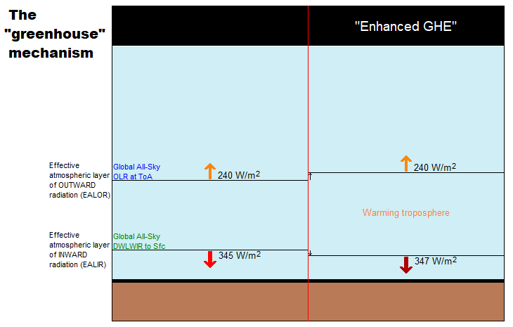
Figure 4. Note, this schematic disregards – for the sake of simplicity – any solar warming at work.
However, we also expect to observe one more “greenhouse” signature.
If we expect the OLR at the ToA to stay relatively flat, but the DWLWIR at the sfc to increase significantly over time, even relative to tropospheric temps, then, if we were to compare the two (OLR and DWLWIR) directly, we’d, after all, naturally expect to see a fairly remarkable systematic rise in the latter over the former (refer to Fig.4 above).
Which means we now have our three ways to test the reality of an hypothesized “enhanced GHE” as a ‘driver’ (cause) of global warming.
Three Tests for GHG Warming in the Sky
The null hypothesis in this case would claim or predict that, if there is NO strengthening “greenhouse mechanism” at work in the Earth system, we would observe:
1. The general evolution (beyond short-term, non-thermal noise (like ENSO-related humidity and cloud anomalies or volcanic aerosol anomalies))* of the All-Sky OLR flux at the ToA to track that of Ttropo (e.g. TLT) over time;
2. The general evolution of the All-Sky DWLWIR at the surface to track that of Ttropo (Ts + Ttropo, really) over time;
3. The general evolution of the All-Sky OLR at the ToA and the All-Sky DWLWIR at the surface to track each other over time, barring short-term, non-thermal noise.
* (We see how the curve of the all-sky OLR flux at the ToA differs quite noticeably from the TLT and DWLWIR curves, especially during some of the larger thermal fluctuations (up or down), normally associated with particularly strong ENSO events. This is because there are factors other than pure mean tropospheric temperatures that affect Earth’s final emission flux to space, like the concentration and distribution (equator→poles, surface→tropopause/stratosphere) of clouds, water vapour and aerosols. These may (and do) all vary strongly in the short term, significantly disrupting the normal temperature↔flux (Stefan-Boltzmann) connection, but in the longer term, they display a remarkable tendency to even out, leaving the tropospheric temperature signal as the only real factor to consider when comparing the OLR with Ttropo (TLT). Or not. The “AGW” idea specifically contends, resting on the premise, that these other factors (and crucially also including CO2, of course) do NOT even out over time, but rather accrue in a positive (‘warming’) direction.)
Missing Fingerprint #1
The first point above we have already covered extensively. The combined ERBS+CERES OLR record is seen to track the general progression of the UAHv6 TLT series tightly, both in the tropics and near-globally, all the way from 1985 till today (the last ~33 years), as discussed at length both here and here.
Since, however, in this post we’re specifically considering the CERES era alone, this is how the global OLR matches against the global TLT since 2000:
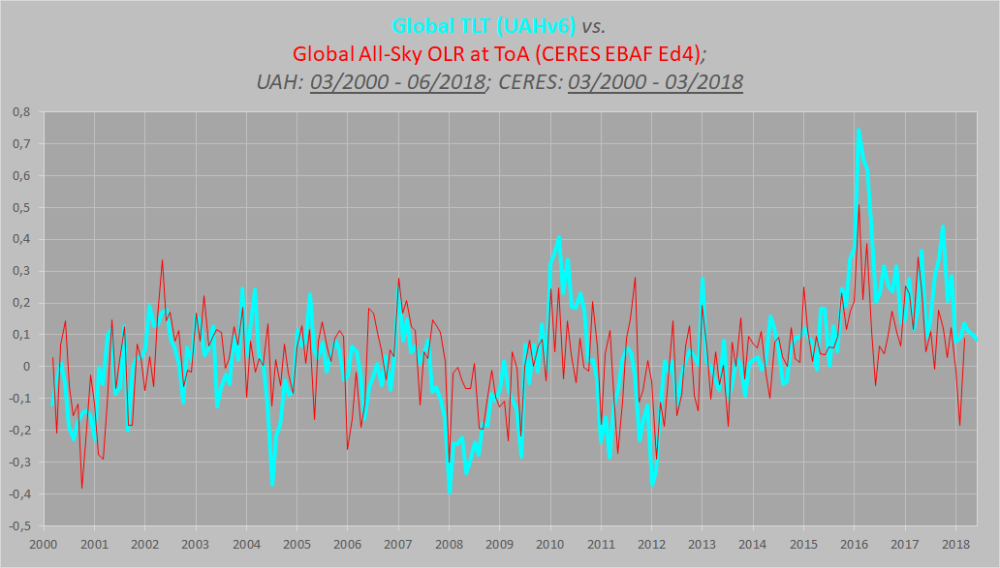 Figure 5.
This is simply the monthly CERES OLR flux data properly scaled (x0.266), enabling us to compare it more directly to temperatures (W/m2→K), and superimposed on the UAH TLT data. Watch how closely the two curves track each other, beyond the obvious noise. To highlight this striking state of relative congruity, we remove the main sources of visual bias in Fig.5 above. Notice, then, how the red OLR curve, after the 4-year period of fairly large ENSO-events (La Niña-El Niño-La Niña) between 2007/2008 and 2011/2012, when the cyan TLT curve goes both much lower (during the flanking La Niñas) and much higher (during the central El Niño), quickly reestablishes itself right back on top of the TLT curve, just where it used to be prior to that intermediate stretch of strong ENSO influence. And as a result, there is NO gradual divergence whatsoever to be spotted between the mean levels of these two curves, from the beginning of 2000 to the end of 2015.
Missing Fingerprint #2
The second point above is just as relevant as the first one, if we want to confirm (or disconfirm) the reality of an “enhanced GHE” at work in the Earth system. We compare the tropospheric temperatures with the DWLWIRsfc ‘flux’, that is, the apparent atmospheric thermal emission to the surface:

Figure 9. Note how the scaling of the flux (W/m2) values is different close to the surface than at the ToA. Here at the DWLWIR level, down low, we divide by 5 (x0.2), while at the OLR level, up high, we divide by 3.76 (x0.266).
We once again observe a rather close match overall. At the very least, we can safely say that there is no evidence whatsoever of any gradual, systematic rise in DWLWIR over the TLT, going from 2000 to 2018. If we plot the difference between the two curves in Fig.9 to obtain the “DWLWIR residual”, this fact becomes all the more evident:
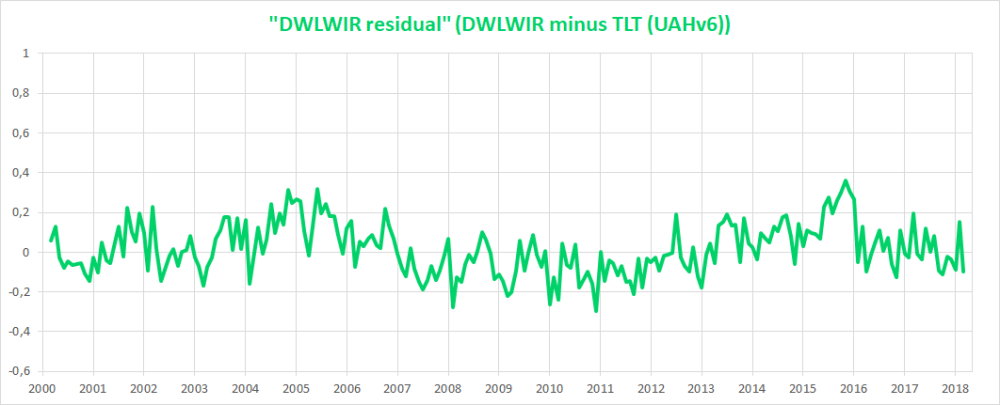 Figure 10.
Remember now how the idea of an “enhanced GHE” requires the DWLWIR to rise significantly more than Ttropo (TLT) over time, and that its “null hypothesis” therefore postulates that such a rise should NOT be seen. Well, do we see such a rise in the plot above? Nope. Not at all. Which fits in perfectly with the impression we got at the ToA, where the TLT-curve was supposed to rise systematically up and away from the OLR-curve over time, but didn’t – no observed evidence there either of any “enhanced GHE” at work.
Missing Fingerprint #3
Finally, the third point above is also pretty interesting. It is simply to verify whether or not the CERES EBAF Ed4 ‘radiation flux’ data products are indeed suggesting a strengthening of some radiatively defined “greenhouse mechanism”. We sort of know the answer to this already, though, from going through points 1 and 2 above. Since neither the OLR at the ToA nor the DWLWIR at the surface deviated meaningfully from the UAHv6 TLT series (the same one used to compare with both, after all), we expect rather by necessity that the two CERES ‘flux products’ also shouldn’t themselves deviate meaningfully overall from one another. And, unsurprisingly, they don’t:

Figure 14. Difference plot (“DWLWIR residual”)
Again, it is so easy here to allow oneself to be fooled by the visual impact of that late – obviously ENSO-related – peak, and, in this case, also a definite ENSO-based trough right at the start (you’ll plainly recognise it in Fig.14); another perfect example of how one’s perception and interpretation of a plot is directly affected by “the end-point bias”. Don’t be fooled:
If we expect the OLR at the ToA to stay relatively flat, but the DWLWIR at the sfc to increase significantly over time, even relative to tropospheric temps, then, if we were to compare the two (OLR and DWLWIR) directly, we’d […] naturally expect to see a fairly remarkable systematic rise in the latter over the former (refer to Fig.4 above).
Looking at Fig.14, and taking into account the various ENSO states along the way, does such a “remarkable systematic rise” in DWLWIR over OLR manifest itself during the CERES era?
I’m afraid not …
Four Lines of Evidence Against GHG Warming Hypothesis
The lack of GHG warming in the CERES data is added to three previous atmospheric heat radiation studies.

- In 2004 Ferenc MIskolczi studied the radiosonde datasets and found that the optical density at the top of the troposphere does not change with increasing CO2, since reducing H2O maintains optimal radiating efficiency. His publication was suppressed by NASA, and he resigned from his job there. He has elaborated on his findings in publications as recently as 2014. See: The Curious Case of Dr. Miskolczi
2. Ronan and Michael Connolly studied radiosonde data and concluded in 2014:
“It can be seen from the infra-red cooling model of Figure 19 that the greenhouse effect theory predicts a strong influence from the greenhouse gases on the barometric temperature profile. Moreover, the modeled net effect of the greenhouse gases on infra-red cooling varies substantially over the entire atmospheric profile.
However, when we analysed the barometric temperature profiles of the radiosondes in this paper, we were unable to detect any influence from greenhouse gases. Instead, the profiles were very well described by the thermodynamic properties of the main atmospheric gases, i.e., N 2 and O 2 , in a gravitational field.”
While water vapour is a greenhouse gas, the effects of water vapour on the temperature profile did not appear to be related to its radiative properties, but rather its different molecular structure and the latent heat released/gained by water in its gas/liquid/solid phase changes.
For this reason, our results suggest that the magnitude of the greenhouse effect is very small, perhaps negligible. At any rate, its magnitude appears to be too small to be detected from the archived radiosonde data.” Pg. 18 of referenced research paper
See: The Physics Of The Earth’s Atmosphere I. Phase Change Associated With Tropopause
3. An important proof against the CO2 global warming claim was included in John Christy’s testimony 29 March 2017 at the House Committee on Science, Space and Technology. The text and diagram below are from that document which can be accessed here.
IPCC Assessment Reports show that the IPCC climate models performed best versus observations when they did not include extra GHGs and this result can be demonstrated with a statistical model as well.

Figure 5. Simplification of IPCC AR5 shown above in Fig. 4. The colored lines represent the range of results for the models and observations. The trends here represent trends at different levels of the tropical atmosphere from the surface up to 50,000 ft. The gray lines are the bounds for the range of observations, the blue for the range of IPCC model results without extra GHGs and the red for IPCC model results with extra GHGs.The key point displayed is the lack of overlap between the GHG model results (red) and the observations (gray). The nonGHG model runs (blue) overlap the observations almost completely.
An Alternative Theory of Natural Climate Change
Dan Pangburn is a professional engineer who has synthesized the solar and oceanic factors into a mathematical model that correlates with Average Global Temperature (AGT). On his blog is posted a monograph Cause of Global Climate Change explaining clearly his thinking and the maths. I provided a post with some excerpts and graphs as a synopsis of his analysis, in hopes others will also access and appreciate his work on this issue. See Quantifying Natural Climate Change
Footnote on the status of an hypothetical effect too small to be measured: Bertrand Russell’s teapot

Open image in new tab to enlarge.
Postscript: For an explanation why CO2 has negligible effect on thermal properties of the atmosphere, and why all W/m2 are not created equal, see: Light Bulbs Disprove Global Warming

Reblogged this on Climate- Science.press.
LikeLike
Reblogged this on Climate Collections.
LikeLike
This will take a while to digest …
Even Pat Michaels and R. Lindzen assume there is some sensistivity factor that might be large enough to measure, but which is appreciably smaller than the ‘classic’ 3 degrees per doubling (+/- 1.5). I wonder what they would say about this argument.
LikeLike
rw, Richard Lindzen ended a very fine recent presentation with this description of the climate system:
I haven’t spent much time on the details of the science, but there is one thing that should spark skepticism in any intelligent reader. The system we are looking at consists in two turbulent fluids interacting with each other. They are on a rotating planet that is differentially heated by the sun. A vital constituent of the atmospheric component is water in the liquid, solid and vapor phases, and the changes in phase have vast energetic ramifications. The energy budget of this system involves the absorption and reemission of about 200 watts per square meter. Doubling CO2 involves a 2% perturbation to this budget. So do minor changes in clouds and other features, and such changes are common. In this complex multifactor system, what is the likelihood of the climate (which, itself, consists in many variables and not just globally averaged temperature anomaly) is controlled by this 2% perturbation in a single variable? Believing this is pretty close to believing in magic. Instead, you are told that it is believing in ‘science.’ Such a claim should be a tip-off that something is amiss. After all, science is a mode of inquiry rather than a belief structure.
LikeLike
rw, a further reference comes from the brief submiitted by Professors Happer, Koonin and Lindzen to the Climate Tutorial for Judge Alsup. The pertinent citation is as follows:
“On average, the absorption rate of solar radiation by the Earth’s surface and atmosphere is equal to emission rate of thermal infrared radiation to space. Much of the radiation to space does not come from the surface but from greenhouse gases and clouds in the lower atmosphere, where the temperature is usually colder than the surface temperature, as shown in the figure on the previous page. The thermal radiation originates from an “escape altitude” where there is so little absorption from the overlying atmosphere that most (say half) of the radiation can escape to space with no further absorption or scattering. Adding greenhouse gases can warm the Earth’s surface by increasing the escape altitude. To maintain the same cooling rate to space, the temperature of the entire troposphere, and the surface, would have to increase to make the effective temperature at the new escape altitude the same as at the original escape altitude. For greenhouse warming to occur, a temperature profile that cools with increasing altitude is required.
Over most of the CO2 absorption band (between about 580 cm-1 and 750 cm-1 ) the escape altitude is the nearly isothermal lower stratosphere shown in the first figure. The narrow spike of radiation at about 667 cm-1 in the center of the CO2 band escapes from an altitude of around 40 km (upper stratosphere), where it is considerably warmer than the lower stratosphere due heating by solar ultraviolet light which is absorbed by ozone, O3. Only at the edges of the CO2 band (near 580 cm-1 and 750 cm-1 ) is the escape altitude in the troposphere where it could have some effect on the surface temperature. Water vapor, H2O, has emission altitudes in the troposphere over most of its absorption bands. This is mainly because water vapor, unlike CO2, is not well mixed but mostly confined to the troposphere.”
A synopsis of that submission was posted as https://rclutz.wordpress.com/2018/03/22/cal-climate-tutorial-the-meat/
LikeLiked by 1 person
Thanks very much Ron. The comment by Lindzen is very compelling, but since I’m still an utter tyro in this area, just about everything I read seems fairly compelling. What I do know from reading stuff from the 70s and 80s when this thing was gathering steam (e.g. the SCOPE reports, NRC reports (incl. the 1st and 2nd report on CO2 and temperature), and the WMO conference reports) is that a number of capable people were putting a good deal of thought into the matter. It seems clear to me that it went wrong somewhere, but it will take me a long time to really decide where the science ends and the hysteria begins, which in fact is my principal interest. Just to clarify, I’m not a physical scientist, and my chief interest in AGW is as a social psychological phenomenon. But, of course, the fascinating thing is that with AGW we really do have a great social hysteria shot through with science (good, bad, and pseudo – from what I can tell at present). So even with my slant on this thing, I have to digest as much of the physical science as I am able.
Anyway, thanks again.
LikeLike
thanks for the comment rw. One of the ironies about AGW is its complexity makes it the ultimate generalist problem. As Bob Carter pointed out, despite having several degrees himself in relevant subjects, he could not claim to be an expert in climate science; in fact no one can. Which means even the alarmist talking heads are depending on words from others on various technical matters that bear on the issue. So it is that Judith Curry and John Christy are closest to the truth when they say, Nobody knows what will happen to future weather as a result from burning fossil fuels. We do know how enormously both civilization and the biosphere have benefited from coal, oil and natural gas. Should all of that be given up over suppositions with no empirical foundations?
LikeLike
If the effective emission altitude rises (which means inter alia that the 255K temperature occurs at a higher altitude) with rising CO2, then per force doesn’t the lapse rate change? It has to. This should be easy to track over time. So why hasn’t the official lapse rate changed?
LikeLike
david, The lapse rate is a function of gravity and the air mass (mostly N2 and O2) which is not affected by minor changes in composition. Moist air does have a lower lapse rate than dry due to latent heat. When moist air cools, the water vapor condenses releasing heat that slows the cooling of the air parcel, resulting in a slower lapse rate.
The AGW theory depends on the lapse rate not changing, hence the higher ERL results in a higher temperature at the surface. Raising the temperature at the TOA results in raising the surface temperature as along as the lapse rate is unchanged.
LikeLike
I see you mention the Connolly’s, but I didn’t see this video of them.
Sorry if you did and I missed it, but if you don’t have it I thought you and your readers may like it.
H/T – Commentor DMA at WMBriggs blog
https://wmbriggs.com/post/28417/#comment-182834
LikeLike